Lead generation focused website for a newly launched moving company
About American Central Moving
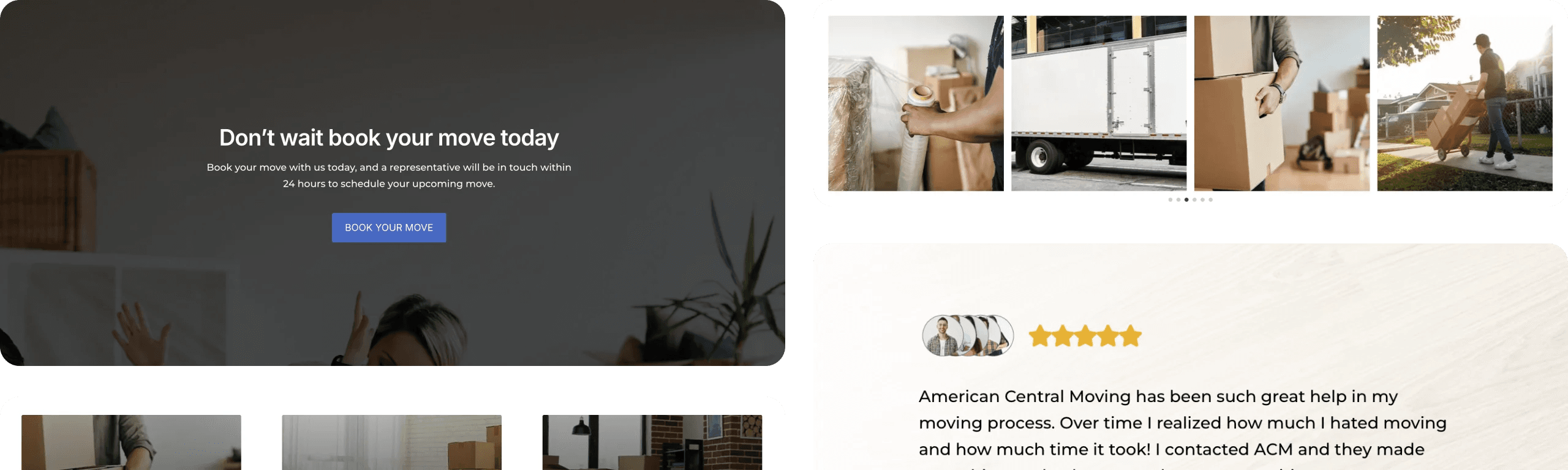
Trusted movers delivering peace of mind
American Central Moving stands out as a reliable moving company committed to ensuring a smooth and stress-free relocation experience. Offering professional, on-time delivery and pick-up services, the team prioritizes the safety and satisfaction of every customer. From carefully packing your belongings to ensuring they arrive in pristine condition, their focus on customer care and customizable moving options sets them apart in the St. Louis area and beyond.
PROJECT SCOPE
What services we brought to the table
- Website Design
- Website Development
- Branding
- Search Engine Optimization
OUR APPROACH
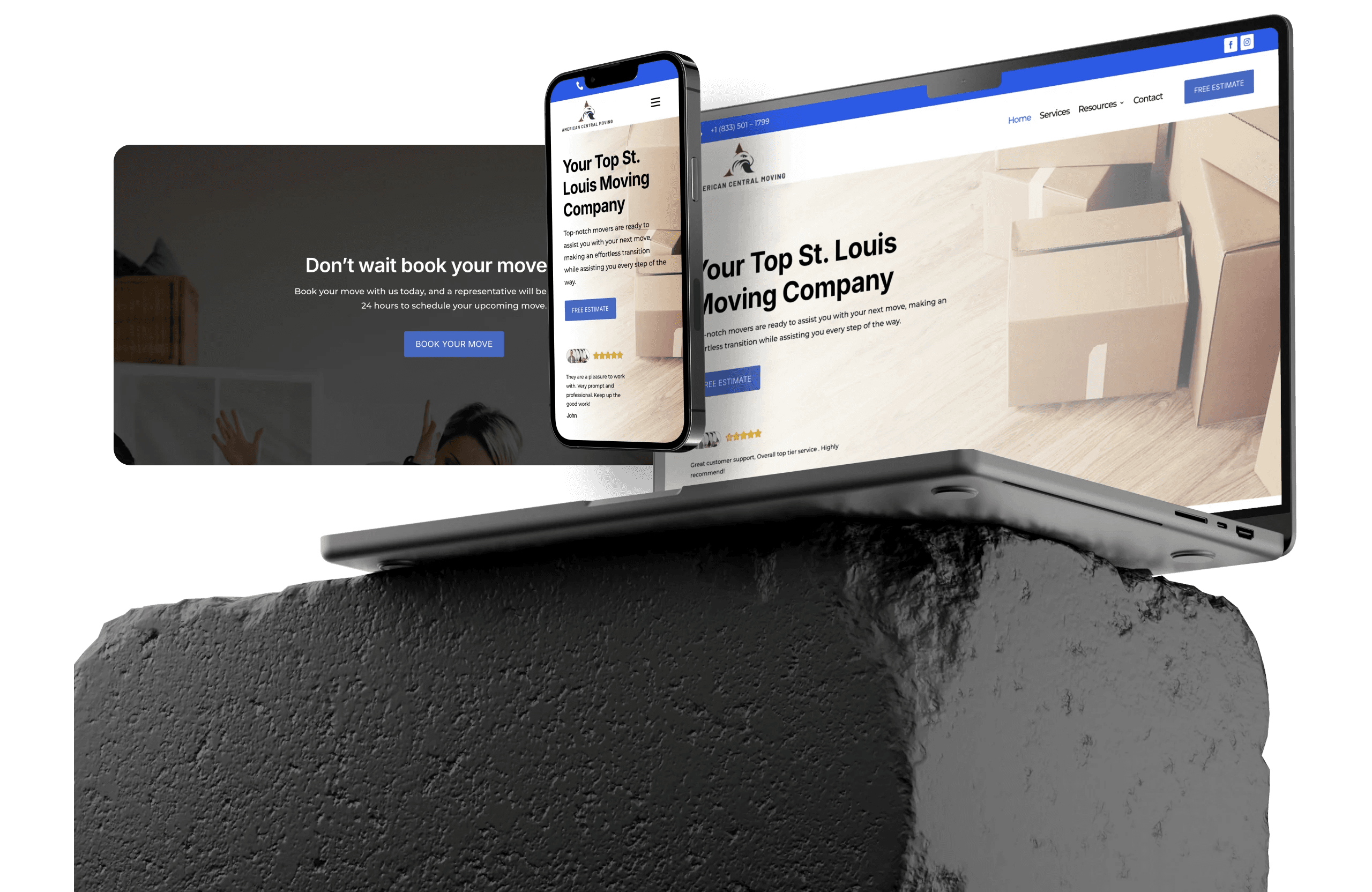
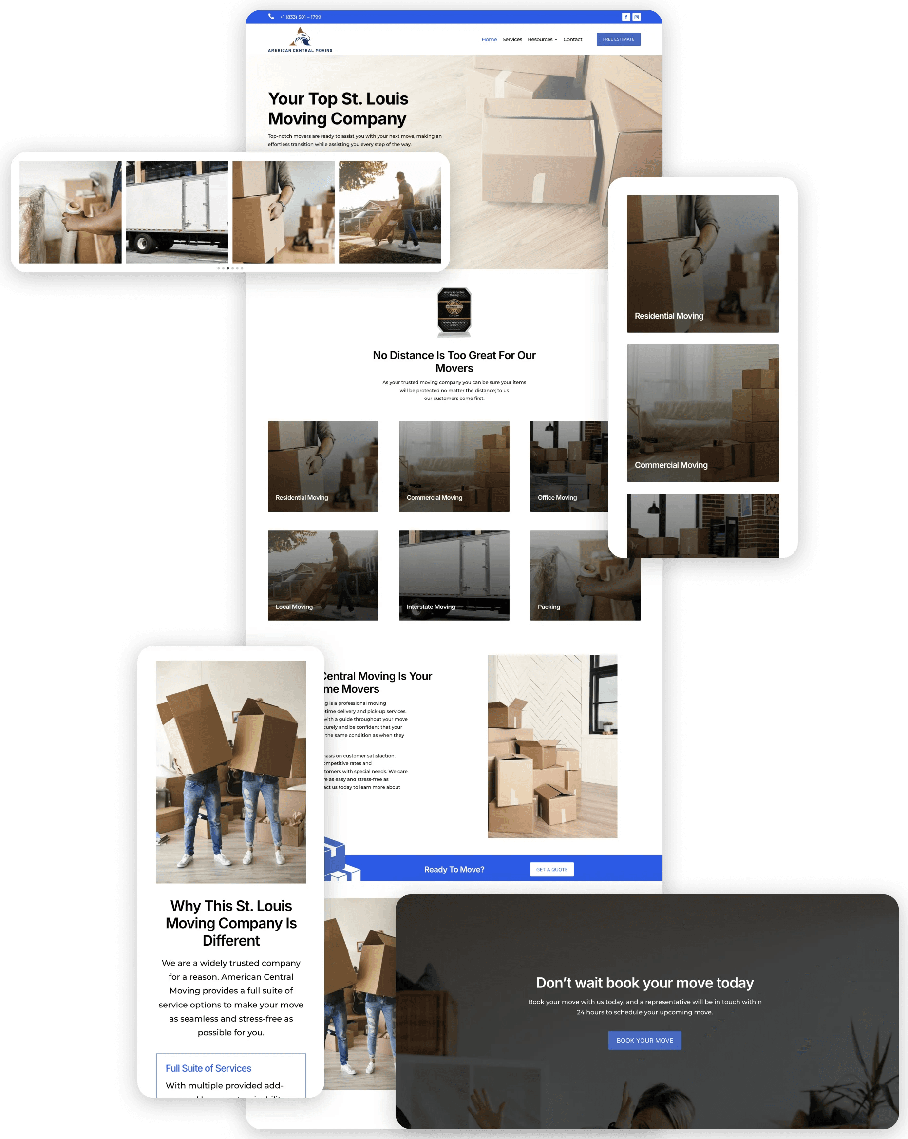
Streamlining your move with expert care
Our approach was to design a website that reflects the professionalism and reliability of American Central Moving while prioritizing ease of use for customers. Through intuitive navigation and clear calls to action, the site ensures that users can explore moving options, learn about services, and connect with coordinators effortlessly. The focus was on crafting a seamless user experience that mirrors the stress-free moving process the company delivers.
My husband and I had the best experience with this company. As someone who has no knowledge of what it takes to get a website up and running I was astonished with the tentative care we received during the entire process. We were walked through the whole process in terms that we understood and were able to get all of the specific details we wanted on the website.
Melisa Bajric
COO
BRANDING
Professional branding for trusted relocation services
The branding captures the professionalism and dependability of the company through a clean blue and white color palette that exudes trust and reliability. Using Inter for bold, modern headings and Montserrat for approachable, easy-to-read body text, the design reinforces the company’s dedication to providing exceptional service. The minimalistic and professional aesthetic ensures that customers feel confident choosing a company that puts their needs first.